
Build a mega menu
A mega menu is a wide multi-column dropdown used for primary navigation with many grouped entries. Think of the "Shop" dropdown in a large e-commerce header: 4 columns, each with a category title and 5–8 links, plus an image on the right.
Prerequisite: You have the Menu Editor open with at least one top-level item. If not, read Menu Editor overview first.
When to use a mega menu
Use a mega menu when a single top-level item has many children and you want to group them visually. Examples:
- E-commerce: Shop → Categories, Brands, Collections, Sale, each with 6–10 entries.
- Documentation sites: Products → Feature groups, API, Guides, Downloads.
- Corporate sites: About us → Company, Leadership, Careers, News, Contact.
If your top-level item has fewer than 6 children and no natural grouping, a regular submenu is simpler — use a Page or Label item with nested children.
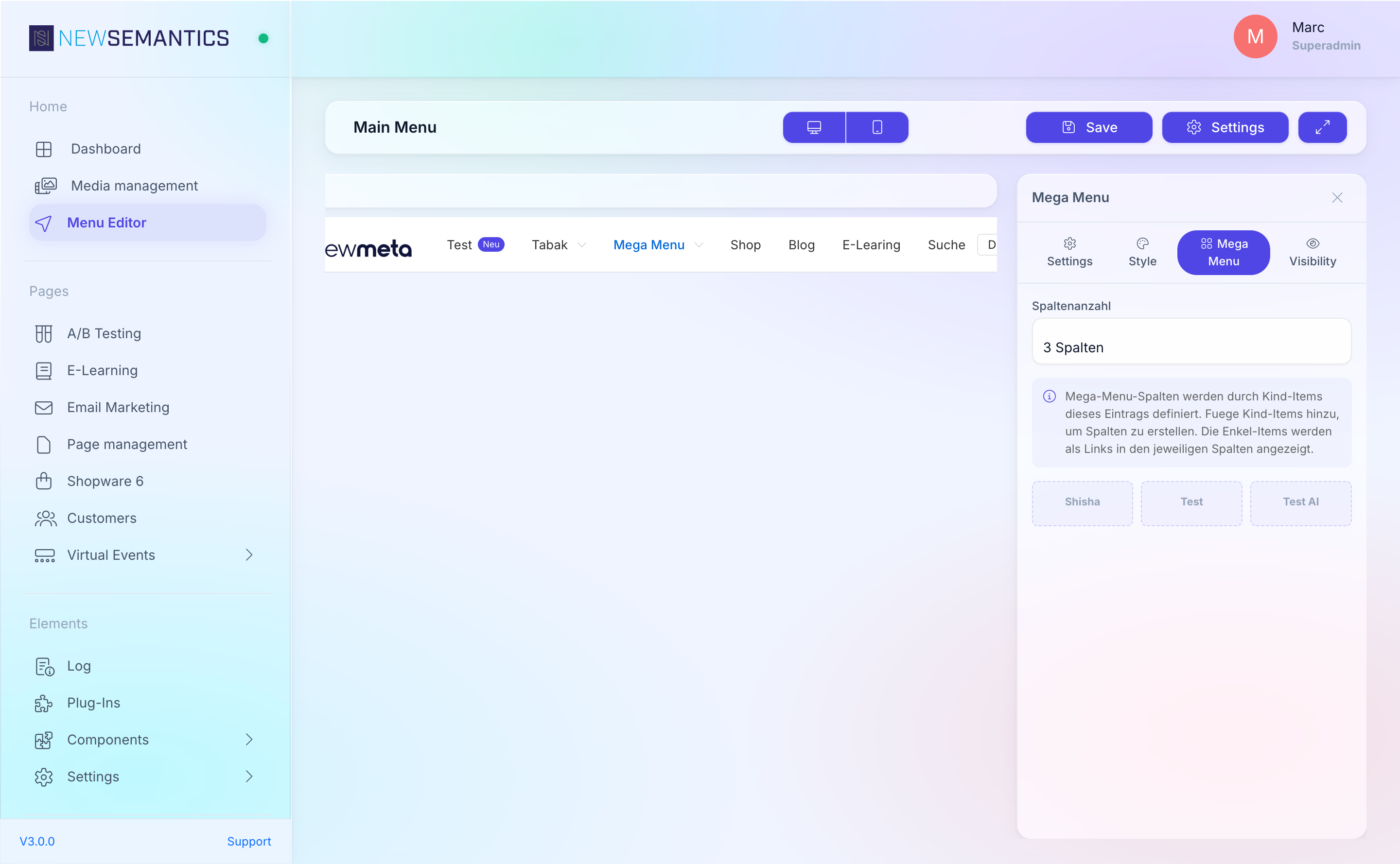
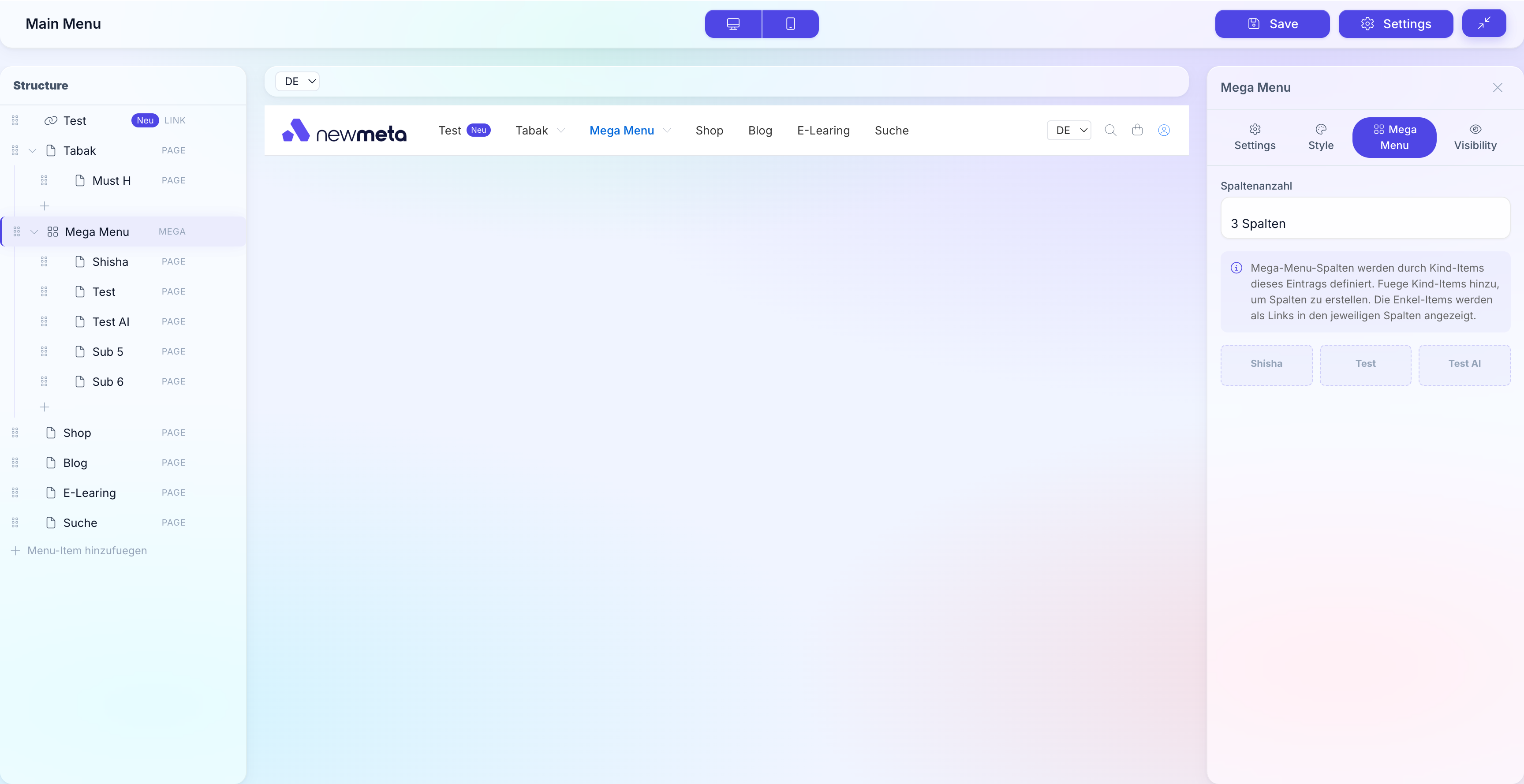
Create a mega item
- Add a new top-level item in the Structure Tree.
- In the Properties Panel, set Type to Mega.
- Fill in Label (the text shown in the top bar).
- In the Mega menu section, pick the Column count (2 to 6).
- Save.
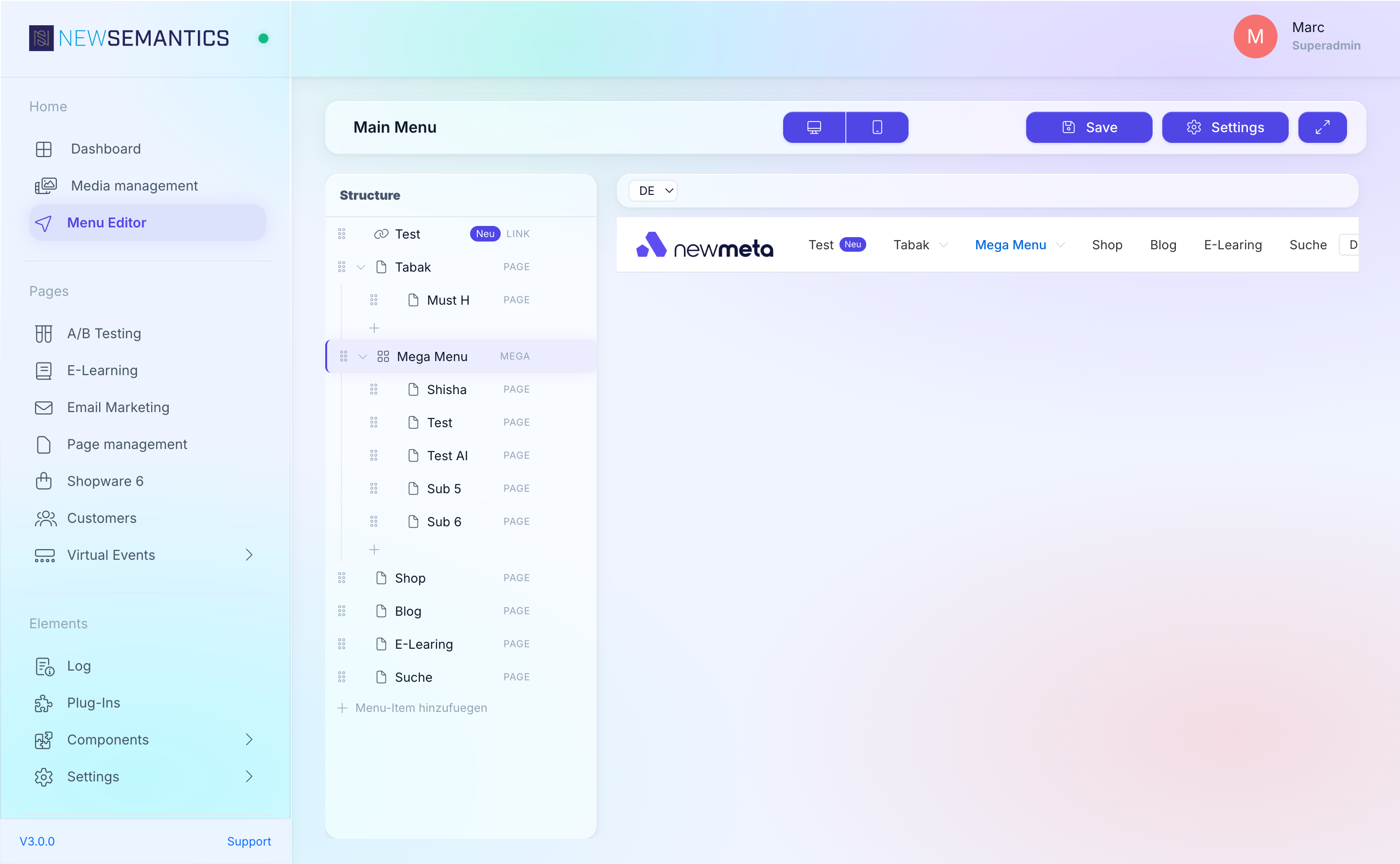
Add columns and links
Inside a Mega item, children of level 1 are the columns. Children of level 2 are the links inside those columns.
Mega item: "Products"
├── Column 1: "Devices"
│   ├── Link: "Phones"
│   ├── Link: "Tablets"
│   └── Link: "Wearables"
├── Column 2: "Software"
│   ├── Link: "Operating System"
│   └── Link: "Apps"
└── Column 3: "Accessories"
    ├── Link: "Cases"
    └── Link: "Chargers"
To build this:
- Select the Mega item.
- Click Add menu item — this adds a child (becomes a column). Set its Label.
- With the new column selected, click Add menu item again — this adds a grandchild (becomes a link inside that column). Set Type to Page or Link, fill in the target.
- Repeat for more columns and links.
Add an image
A Mega item optionally renders an image on the right side of the dropdown — great for a campaign banner or a product hero shot.
- Select the Mega item.
- In the Properties Panel, scroll to Image.
- Click into the image field. The Media Manager opens.
- Pick an image and click Save.

Style the column headers
The top-level Label in each column renders as a header. To make it look different from the link rows, add an Icon, a custom CSS Class, or Custom CSS — all from the column's Properties Panel.
Keep column headers non-clickable
If a column header should be a section label without navigation, set its Type to Label. The header renders as plain text; only the child links are clickable.
Preview
Click the Mega item in the Live Preview to expand the dropdown. Switch the top-bar breakpoint to Mobile to verify the mobile variant — mega menus usually collapse into a vertical list on small screens.
Limits and tips
- Maximum 6 columns — more does not fit on common screens and hurts scannability.
- 5–8 links per column is ideal. 10+ feels dense.
- Images are optional — only use when the image adds real value; otherwise more columns are better.
- Mobile falls back to a vertical accordion — test it before publishing.
See also
- Edit menu items — the five item types, icons, badges, visibility.
- Menu Editor overview
- Media Manager — manage images used in the mega menu.