
Design Tokens
Design Tokens are the central knobs for your site's look and feel. Colors, fonts, spacing, border radius, breakpoints — all live in one LESS stylesheet that compiles to CSS and applies everywhere on the public site.
This page shows you how to open the editor, change tokens, preview the result, and save.
Where the module lives
Click Settings → Design in the sidebar. The CodeMirror LESS editor opens with the live stylesheet loaded from the database.
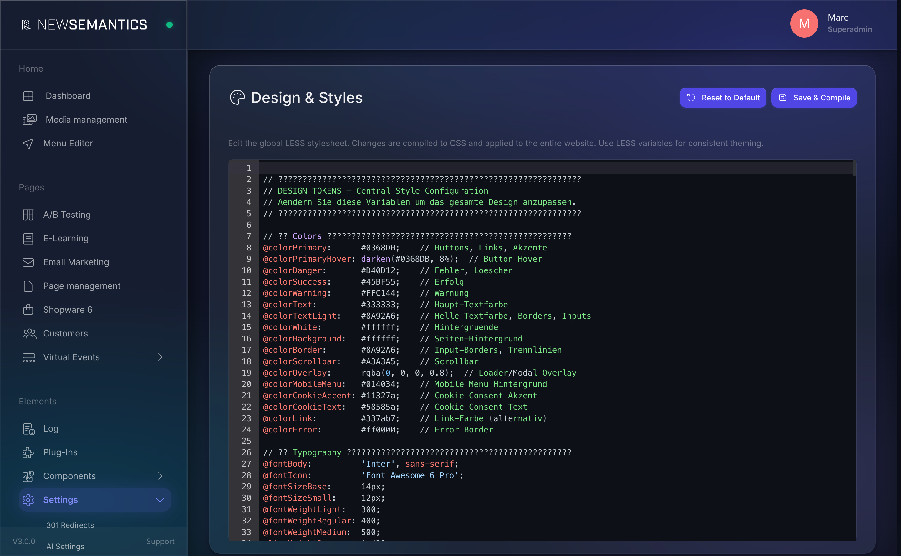
What lives in the stylesheet
The top section of the file is a flat list of LESS variables grouped by purpose. Below them, the :root { ... } block exposes the same values as CSS custom properties for runtime access (for example from widget CSS).
Everything below that point is regular CSS. You can edit it too, but the tokens at the top are where most changes should happen — they flow through the whole design.
Colors
| Token | Purpose |
|---|---|
@colorPrimary | Buttons, links, accents. The dominant brand color. |
@colorPrimaryHover | Hover state for buttons. Usually a darkened primary. |
@colorDanger | Errors, delete actions. |
@colorSuccess | Success messages. |
@colorWarning | Warnings, soft alerts. |
@colorText | Body text. |
@colorTextLight | Secondary text, borders, input outlines. |
@colorBackground | Page background. |
@colorBorder | Input borders, dividers. |
@colorLink | Text links (alternative to primary). |
@colorError | Error input border. |
Typography
| Token | Purpose |
|---|---|
@fontBody | Main font stack for body text. |
@fontIcon | Icon font (Font Awesome by default). |
@fontSizeBase | Base font size (default 14px). |
@fontSizeSmall | Small text, captions, labels. |
@fontWeightLight / @fontWeightRegular / @fontWeightMedium | Weights used across the site. |
@lineHeightBase | Base line height. |
Spacing
| Token | Purpose |
|---|---|
@spacingBase | Unit for fine adjustments (8px). |
@spacingSmall / @spacingMedium / @spacingLarge / @spacingXLarge | Progressive paddings and margins. |
@spacingSection | Vertical gap between Pagebuilder rows (.ns-row). |
@spacingForm | Gap between form groups. |
Layout and shadows
| Token | Purpose |
|---|---|
@radiusBase | Corner radius for buttons, inputs, cards. |
@radiusRound | Pill-shaped elements. |
@inputHeight | Height of form inputs. |
@buttonLineHeight | Line height for .btn. |
@shadowCard | Card / nav drop shadow. |
Breakpoints
| Token | Purpose |
|---|---|
@breakpointDesktop | Below this width, desktop rules stop applying (default 991px). |
@breakpointMobile | Below this width, mobile rules kick in (default 768px). |
Change a token
- Open Settings → Design.
- Locate the variable at the top of the file (for example
@colorPrimary). - Change the value. Use any valid LESS value — hex,
rgb(),rgba(), LESS helpers likedarken(#0368DB, 8%). - Click Save & Compile in the top right.

The Frontend picks up the new CSS on the next page load — no deployment, no Nuxt rebuild needed.
Preview before save
Changes are only applied after Save & Compile. Open the public site in a second browser tab and reload it after saving to see the result.
Reset to the default stylesheet
If you need to undo a session's worth of changes, click Reset to Default in the top right. You are asked to confirm. The editor loads the shipped default LESS file; Save & Compile writes it back to the database.
Reset wipes the custom stylesheet
Reset replaces every line in the editor — your own CSS rules below the token section are also lost. Copy custom blocks you want to keep before you reset.
Custom LESS vs. Theme LESS
Two stylesheet layers combine on the public site:
- Custom LESS (this editor) — lives in the database, editable in the Backend, reloads without a deploy.
- Theme LESS (
_theme/{project}/public/css/…) — ships with the Nuxt theme. Only changeable by a developer with access to the code. Compiled at build time.
Custom LESS is loaded after Theme LESS, so Custom rules win when they match the same selector.
If a token is defined in Custom LESS, it also overrides the theme default for the --me-* Menu Editor variables and any widget that uses the --color-* custom properties.
Where the file is stored
The compiled CSS goes into the server's CSS cache and the LESS source lives in the website.custom_less column. A syntax error in your LESS keeps the previous CSS in place and surfaces an error under the editor — so you can never break the live site by typing a wrong bracket.
Common issues
Syntax errors block save
If LESS does not compile, the save fails and a red banner shows the error line. Fix the error and click Save & Compile again. The old CSS stays live in the meantime.
Color functions need hex input
LESS helpers like darken(), lighten(), fade() require hex values. Passing rgb() or a CSS variable into them does not work.
Browser cache
After save, force-reload the public site (Ctrl+Shift+R or Cmd+Shift+R) if you still see the old colors. The CMS sets cache headers on the compiled CSS but browsers can ignore them on a soft reload.
See also
- SEO Meta per page — title, description, canonical, OG image.
- Redirects — keep URLs working after a rename.
- AI Text Generation — generate CSS snippets with AI.