
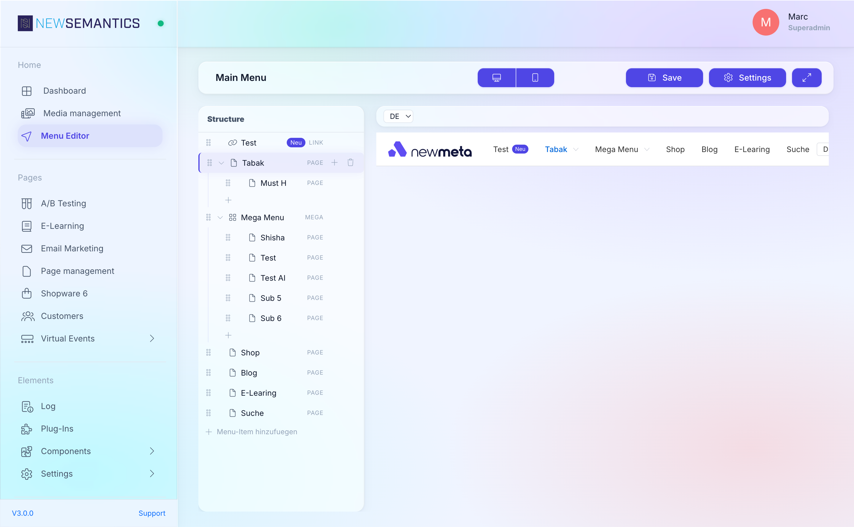
Edit menu items
Every entry in the Menu Editor is one of five item types: Page, Link, Anchor, Label, or Mega. Each type has its own required fields. This page walks through all of them.
Prerequisite: You have the Menu Editor open with at least one item selected. If not, read Menu Editor overview first.
The five item types
Select an item in the Structure Tree. In the Properties Panel, the Type dropdown at the top picks the item type.

| Type | Links to | Typical use |
|---|---|---|
| Page | An internal page (by identifier) | 95% of navigation items — e.g. "About us" linking to /ueber-uns. |
| Link | An external URL | Social links, off-site partner pages, downloadable PDFs hosted elsewhere. |
| Anchor | A fragment on the current page (#section) | Single-page navigation to scroll sections. |
| Label | Nothing — renders as plain text | Section headers inside a submenu, non-clickable group labels. |
| Mega | Wide multi-column dropdown | Primary nav with images and grouped children. Read Build a mega menu. |
Page item
A Page item links to an internal page by its identifier (the URL slug from Page Management).
Fields:
- Label — text shown in the menu.
- Page identifier — dropdown of all existing pages. Pick one.
- Translations: Label is language-specific. The page identifier resolves to the correct language variant automatically.
Link item
A Link item links to any URL — on your domain, on another domain, or mailto: / tel:.
Fields:
- Label
- Link URL — full URL (e.g.
https://example.com,mailto:info@...,tel:+49...). - Target —
_self(open in same tab) or_blank(open in new tab). External links typically set_blank.
Anchor item
An Anchor item scrolls to an element on the current page. Use it for one-page layouts with a sticky navigation.
Fields:
- Label
- Anchor — the ID of the target element, without the
#. E.g.aboutfor<section id="about">.
Anchors only scroll within the current page
Clicking an Anchor item on a page that does not contain the target element reloads the current URL with the fragment. It does not navigate to another page. If you need cross-page jumps, use a Link item with a URL like /pricing#details.
Label item
A Label item is non-clickable. It is used for:
- Section headers inside a submenu.
- Plain-text decorations in the footer.
Fields:
- Label — the only required field.
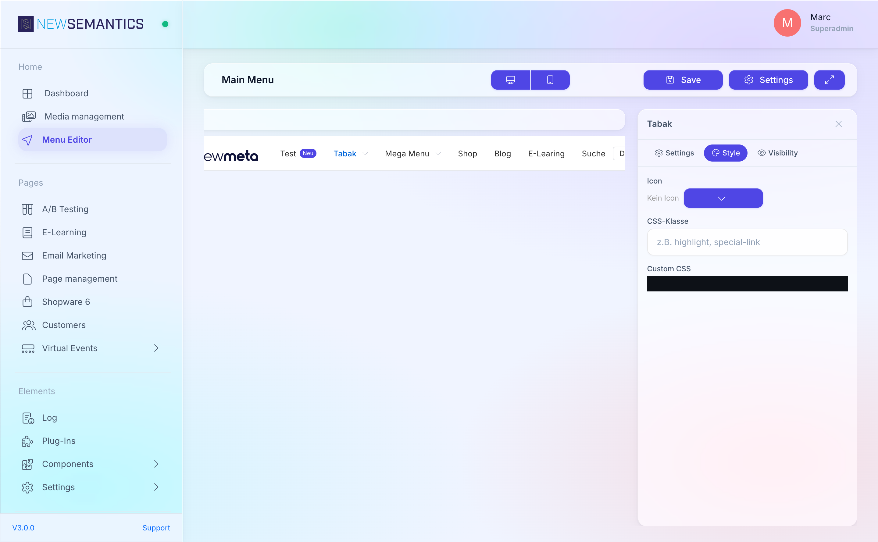
Icons, badges, and extras
Every item type supports these optional fields:
| Field | Effect |
|---|---|
| Icon | Font Awesome icon shown next to the label. Pick from the icon picker. |
| Badge text | Small badge next to the label (e.g. "NEW", "3"). Language-specific. |
| Badge color | Color of the badge (preset colors or custom HEX). |
| CSS Class | Additional CSS class on the <li> element, for custom styling. |
| Custom CSS | CodeMirror editor for per-item CSS rules. |
| Image | Image next to the label (e.g. flag, thumbnail). Opens the Media Manager. |
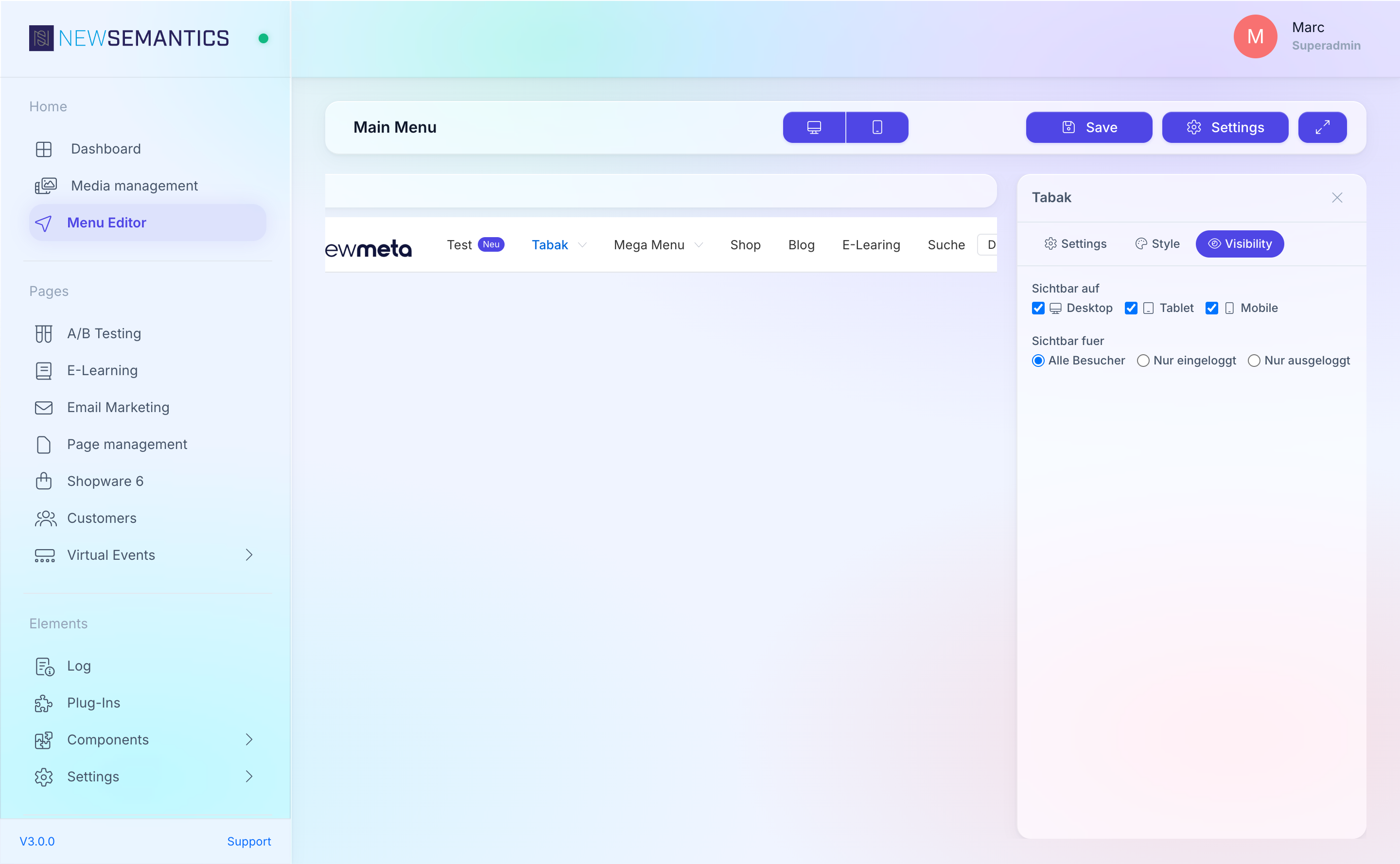
Visibility rules
Each item has a Visibility section with two axes:
- Device — Desktop and / or Mobile. Uncheck one to hide the item on that device class.
- Login status — Always, Only logged in, Only logged out. Use this to show "Login" to anonymous visitors and "My account" to signed-in ones.
Duplicate, delete, reorder
- Duplicate: right-click the item in the Structure Tree, pick Duplicate. The duplicate lands right below the original.
- Delete: right-click, pick Delete. Confirm once.
- Reorder: drag the item to a new position. Drop onto another item to nest as a child.
See also
- Menu Editor overview
- Build a mega menu
- Pages & Pagebuilder — the page identifiers Page items link to.