
Forms & Funnels — Analytics
The Analytics tab gives you everything you need to measure a funnel's performance: top-line KPIs with period-over-period trend, a step-by-step drop-off chart with A/B-aware aggregation, a channel-performance table with drilldown, a Channel × Step drop-off heatmap, time-series, and CSV export on every chart that has tabular data.
This page walks through each visualization, what it tells you, and how to interpret edge cases.
Where the tab lives
Open Pages → Forms & Funnels → Analytics. Pick the funnel from the top-right dropdown, set the date range, and click Refresh to reload. The whole tab loads in parallel — KPI strip, drop-off, branches, channel performance, heatmap, time series, A/B tests are independent queries and don't block each other.
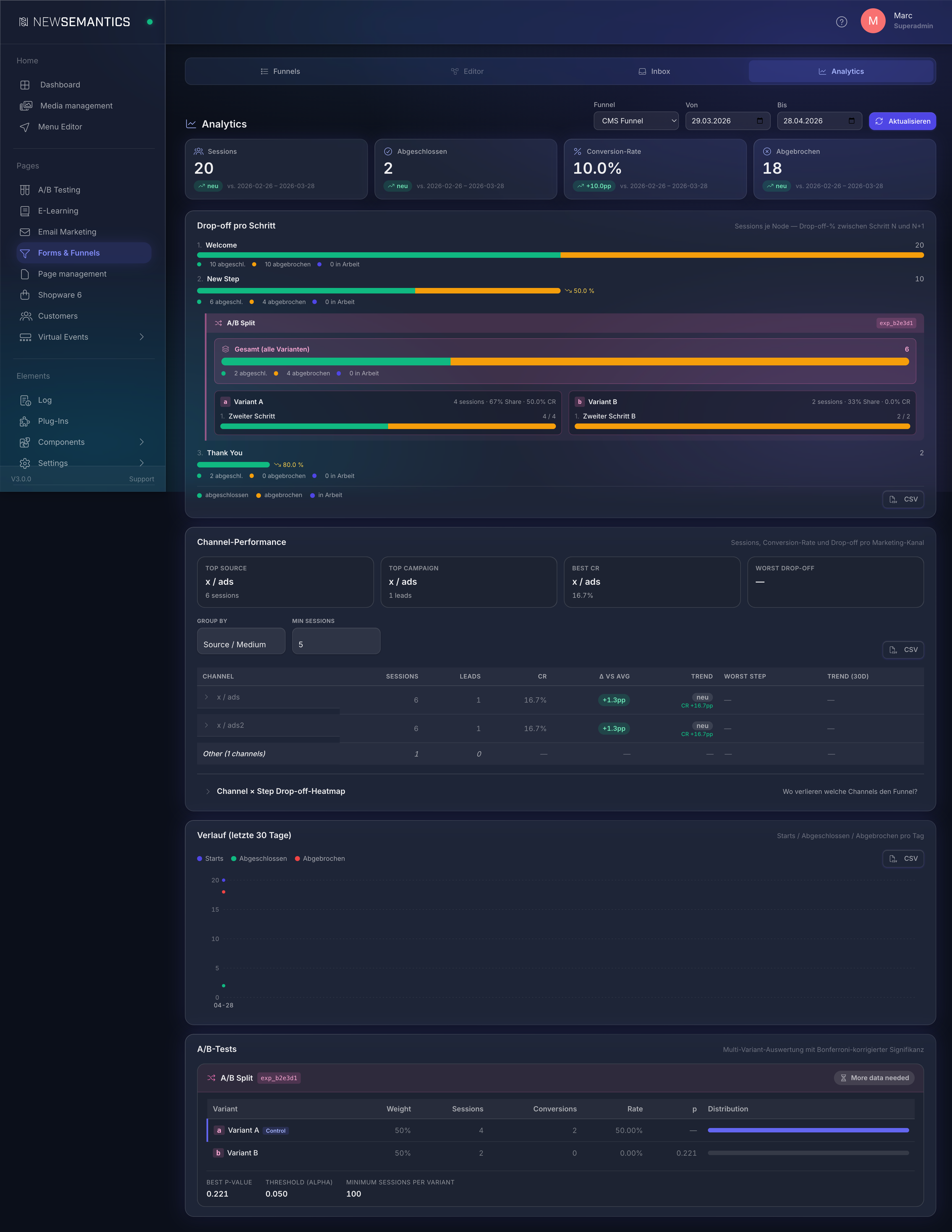
The date range applies to everything on the tab. Default is the last 30 days. The previous-period comparison (see KPI strip) automatically shifts to the same span before the chosen from date.
1. KPI strip — top-line trend
Four tiles at the top: Sessions, Completed, Conversion rate, Abandoned. Each tile shows the absolute value plus a delta pill versus the previous period of equal length.

The delta pills speak two languages:
- Counts (Sessions, Completed, Abandoned) → relative percent (
+25%,−12%). For Abandoned, down is good — the pill turns green on a decrease, red on an increase. - Conversion rate → percentage points (
+12.55pp,−3.2pp). Reads as the absolute gap between the two rates.
pp vs %
pp means percentage points — the absolute difference between two percentages. A CR moving from 12.45% to 25% means +12.55 pp. If we instead wrote +100% (relative change), that would be a different statement. Marketing tools (GA4, HubSpot, Matomo) all use the same convention.
If a metric was 0 in the previous period and is non-zero now, the pill reads new instead of an unbounded percentage.
The previous-period range is shown as a small subtitle (vs. 2026-03-29 – 2026-04-27).
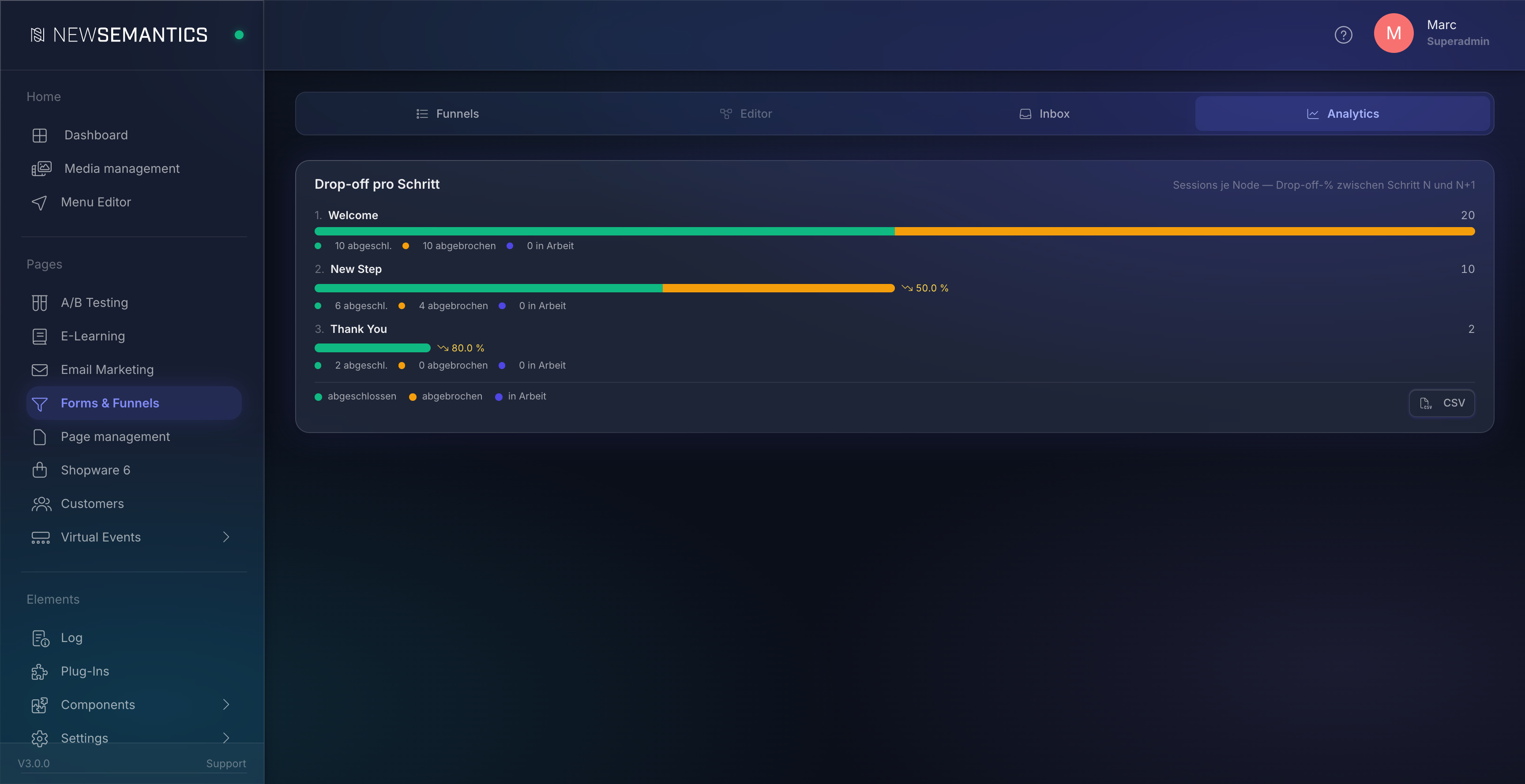
2. Drop-off chart — per step
The vertical stacked-bar chart shows every visible funnel step in flow order with three colors:
- Green —
completed. User left the step toward the next step (or finished the funnel on the last step). - Yellow —
abandoned. User dropped out exactly here (statusabandoned). - Blue —
in progress. User is still on this step (statusin_progress, session still active).
The drop-off percentage between step N and N+1 is shown to the right of step N+1 as a small ↘ XX.X% annotation — only when drop-off > 0.
A/B splits get their own block
If the funnel contains an ab_split node, it does not appear as a single step in the staircase. Instead, the UI renders a pink A/B block container between the pre-block step and the post-block step:
- At the top, an aggregate row "Total (all variants)" — sum of
entered,completed,abandoned,in_progressacross all variants. - Below, per variant, a separate mini-staircase with its own sample size (=
sessions_enteredof that variant). - For each variant step, the drop-off relative to the previous variant step.
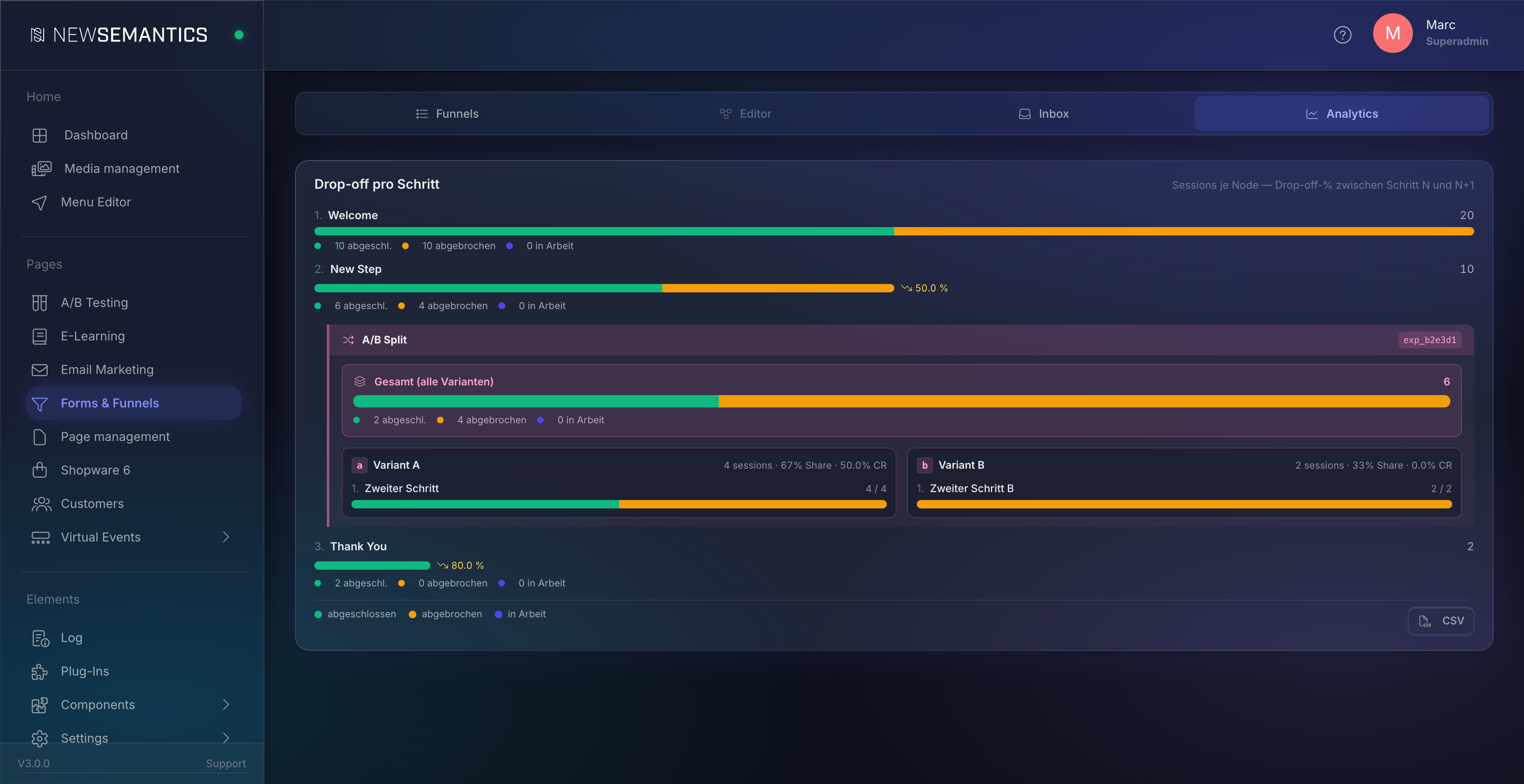
Click the block header
The block header (variant name + experiment ID) is clickable and scrolls to the A/B Tests card further down — there you see the statistical evaluation with Pearson chi-square + Bonferroni-corrected significance.
What does "in progress" mean?
A session counts as "in progress" at step N when it is stuck exactly there — status in_progress, session still active, the path ends on this step. If the path is longer and ends on a later or hidden node (ab_split, variant step), step N is counted as completed (= moved on). This way, the pre-A/B step does not show all sessions as "in progress" that are still inside the A/B block — they have moved on and are aggregated separately inside the A/B block.
3. Branch performance — branches
Table per condition node with the possible branches. Columns: condition name, branch label, sessions, share, optionally conversion rate (= % of sessions that completed the funnel through this branch).
Use case: "Which path of my lead qualification converts better?" — if the country == DE branch has 30% CR and the default branch only 8%, German visitors are more valuable.
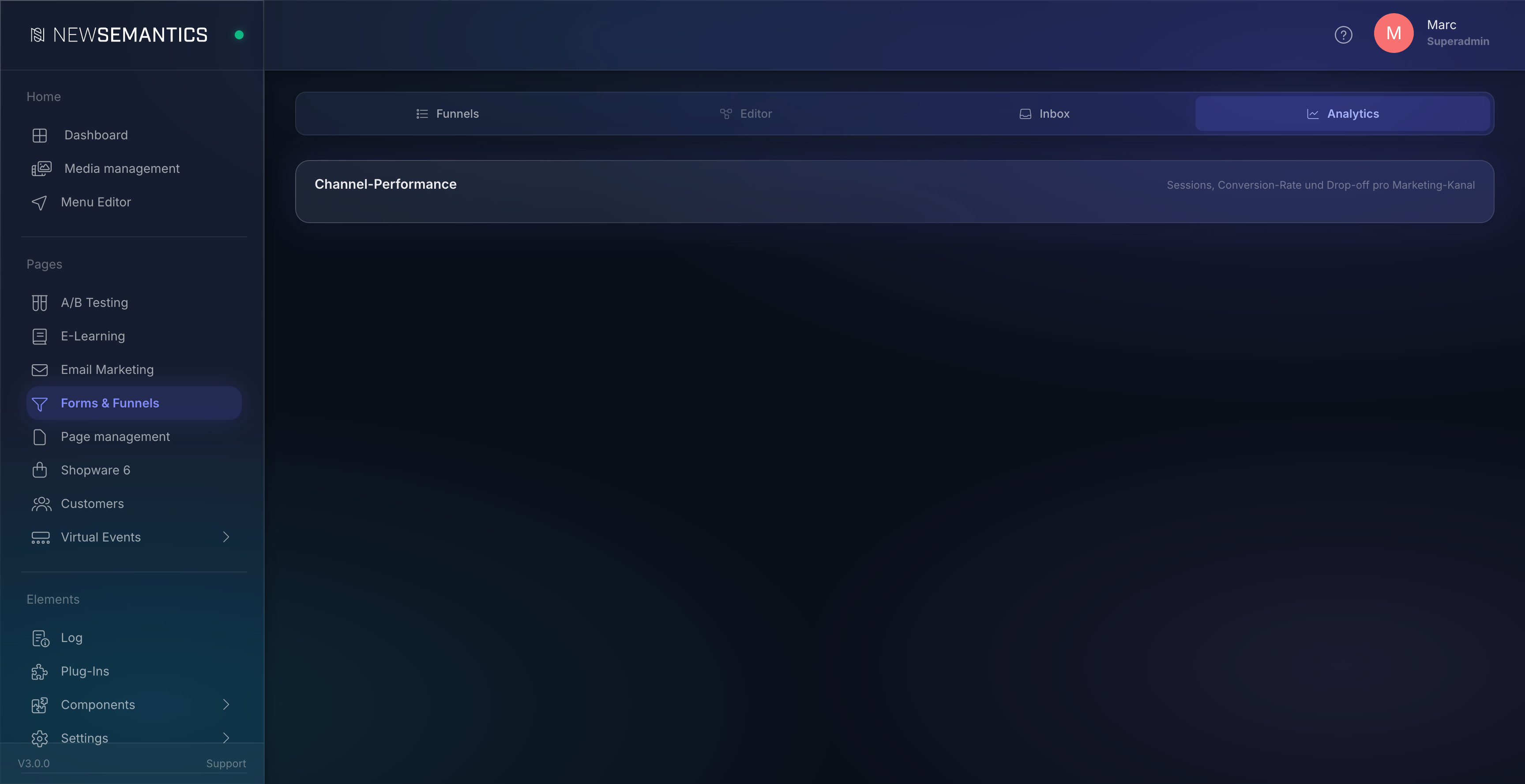
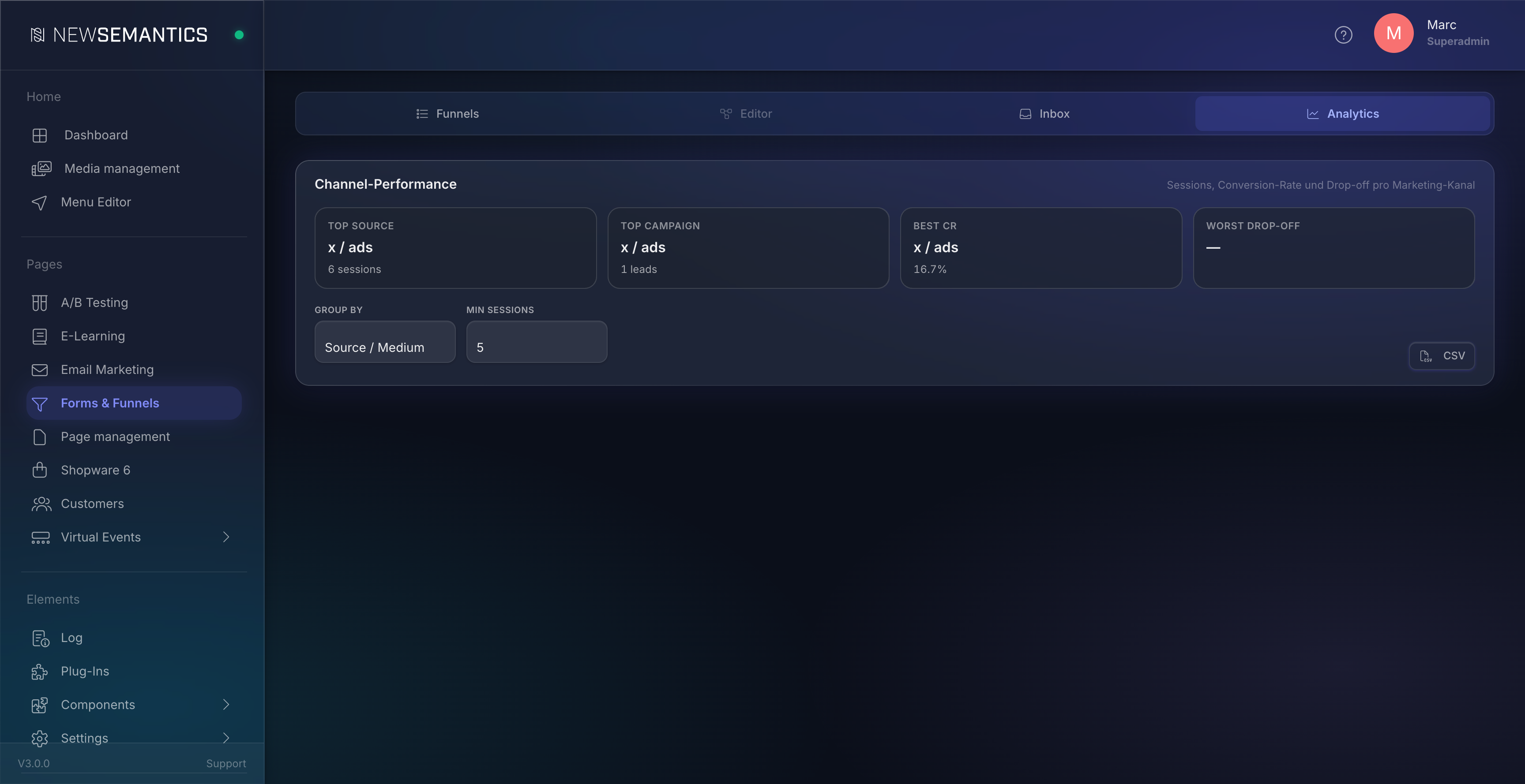
4. Channel performance — marketing channels
If UTM parameters are attached to your funnel URLs (?utm_source=google&utm_medium=cpc), the plugin aggregates submissions per channel. The channel card has three layers:
KPI tiles at the top
Top source, Top campaign, Best CR, Worst drop-off — instant insight in four lines.
Channel table
Default sort: sessions DESC. Columns:
| Column | What it shows |
|---|---|
| Channel | source / medium, depending on the Group-by selection |
| Sessions | Number of sessions for the channel in the time range |
| Leads | Of those, completed |
| CR | Conversion rate as percentage |
| Δ vs Avg | Percentage points against the funnel average (green = better, red = worse) |
| Trend | Relative session change vs. previous period + CR-Δ in pp |
| Worst Step | Step with the highest drop-off in this channel |
| Trend (30d) | 30-day sparkline of daily sessions |
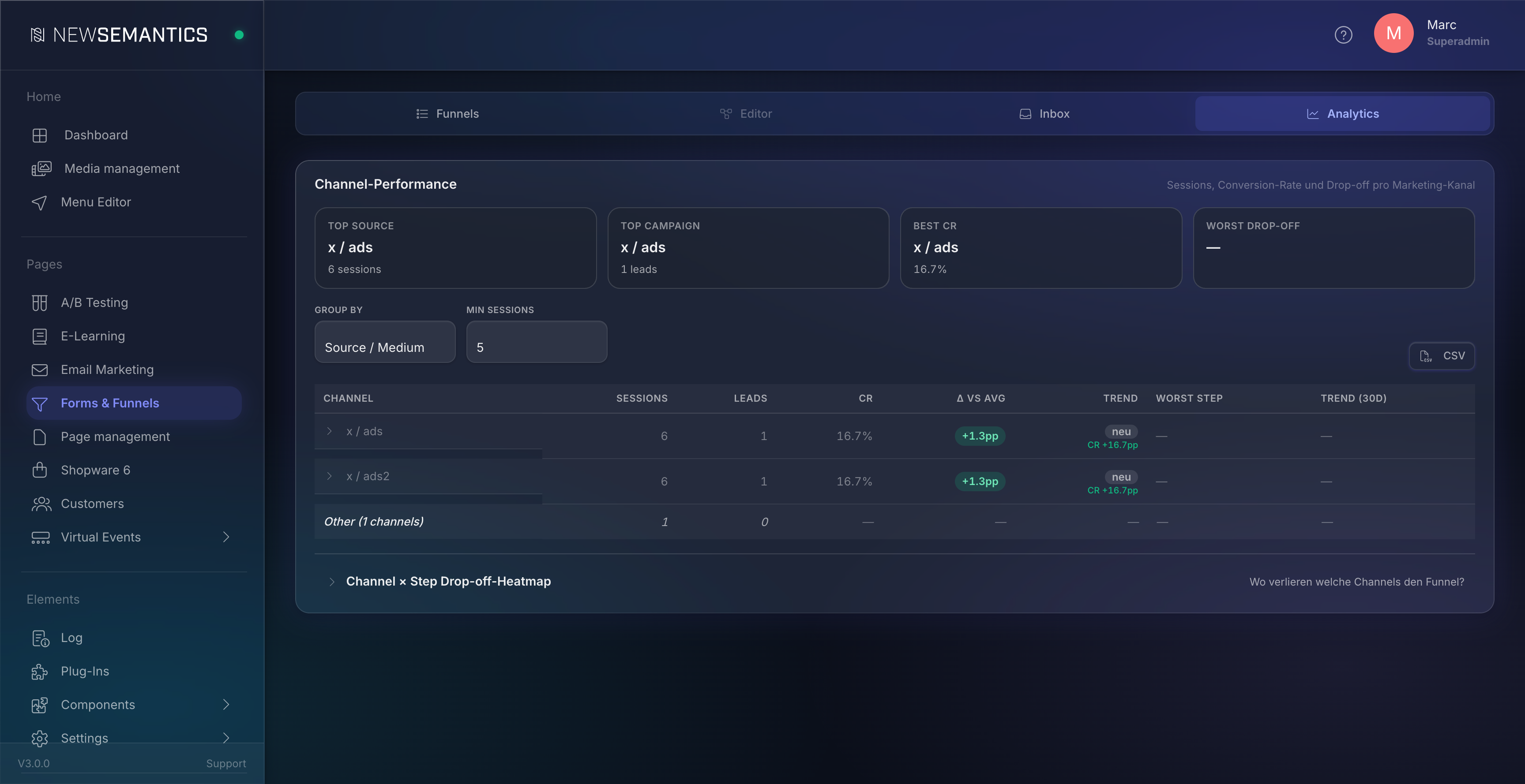
Group-by and Min-Sessions
Above the table header are two selects: Group by (Source / Medium, Channel Group, Campaign) and Min sessions (1 / 5 / 10 / 30 / 100). Channels below the threshold roll into a combined Other row at the bottom of the table. For tests with few submissions, set Min sessions = 1.
Drilldown
Clicking a channel row expands the campaign breakdown as an indented sub-table. Clicking a campaign row expands Term + Content. Lazy-loaded — the server delivers the sub-rows only on first click.
Channel grouping
The Group-by mode Channel Group maps UTM and Referer data to GA4-compliant buckets (Direct, Organic Search, Paid Search, Paid Social, Email, Referral, Organic Social, Display). Even if you do not set UTMs, this grouping captures many sessions — Direct and Organic Search are detected via Referer pattern.
5. Channel × Step drop-off heatmap
A matrix of top-N channels × funnel steps, each cell colored by drop-off rate (step N → step N+1):
- Green: ≤ 10%
- Light green: 10–30%
- Orange: 30–50%
- Red: > 50%
- Grey: no sessions in this cell

Use case: "At which step do which channels lose the funnel?". If Facebook traffic performs great at the top of the funnel but drops 67% at step 4 (phone-number question), the ad is mis-framed or the phone step needs to be optional — a clear action trigger for ad optimization.
A/B column
ab_split nodes appear as their own column with a pink accent and a shuffle icon. sessions_reached for this column = sum of all variant sessions; drop-off = 1 − reached_post / reached_ab (how many users leave the block without reaching the post-block step).
The heatmap is collapsed by default — clicking Channel × Step Drop-off Heatmap below the channel table opens it.
6. Time series — history
Three-line chart per day: Starts (all submissions), Completed, Abandoned. Hover shows date + values.
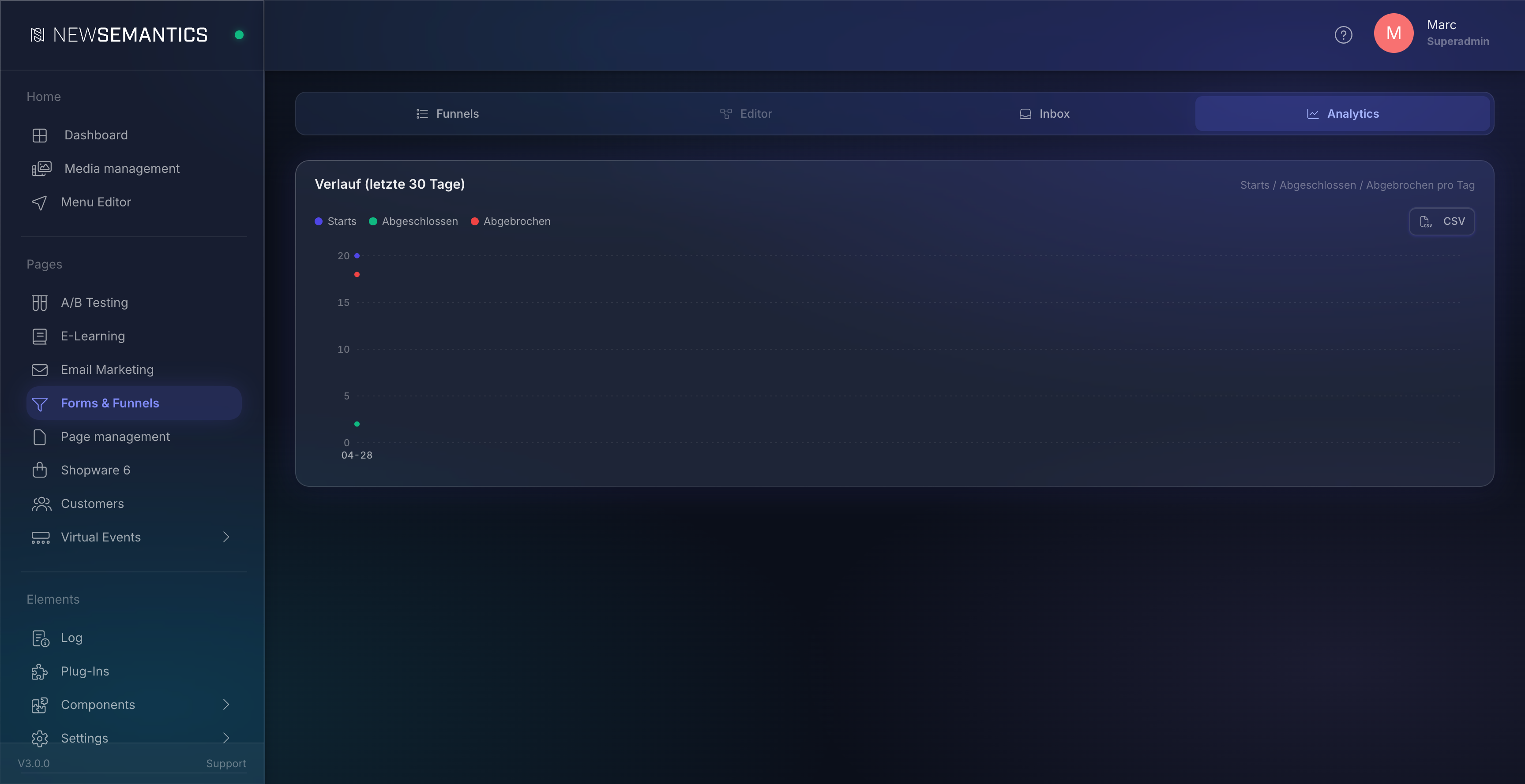
Use case: anomaly detection. If starts drop by 50% on Wednesday, you see it here immediately.
7. A/B Tests card
Per ab_split node in the funnel, its own sub-card with:
- Variant table:
sessions_entered,sessions_completed, conversion rate, Δ-to-control variant, p-value (Pearson chi-square with Bonferroni correction for more than 2 variants), sample-size confidence marker. - Recommendation banner: from
n ≥ 100per variant andp < 0.05, the plugin marks the winner green.
Only appears for funnels with at least one ab_split node and at least one submission per variant.
8. CSV export
Three cards have a small CSV button:
- Channel performance — all visible channel rows including trend columns and worst step.
- History (time series) — date, starts, completed, abandoned per day.
- Drop-off — steps + A/B block aggregate + variants flattened, with a
Rangefilter column.
Encoding: UTF-8 with BOM, CRLF, RFC-4180 quoting — opens directly in Excel with correct umlauts.
Filename pattern: funnel-{ID}-{type}-{from}-{to}.csv (e.g. funnel-12-channels-2026-04-01-2026-04-30.csv).
Data consistency and edge cases
Ephemeral mode (save_abandoned = false)
The default is GDPR-compliant: abandoned submissions are hard-deleted after abandon_after_min (cron process_abandoned.php). Before they go, the worker writes an anonymous aggregate entry per node + channel — from this the dashboard reconstructs drop-off, channel performance, and heatmap. The KPI tiles show the sessions plus the anonymous drop-outs.
Sessions discrepancy before Migration 017
Before Migration 017, the channel aggregate had no date column. Channel reports pulled lifetime counts into every from/to window — for a 6-month-old funnel with a high abandonment share, the reports therefore knew more sessions than the drop-off chart for the same filter range. After Migration 017 the table is daily-granular and all reports match period-by-period. Historical counts were reset on the migration run — fresh data flows in cleanly.
Cache
The backend caches every analytics response in APCu with a generation counter per funnel. Every new submission and every status update increments the counter → the cache key changes → fresh data on the next reload. To see how a just-created test submission lands in the dashboard, simply click Refresh in the topbar.
Channel trend limitation
From Migration 017 onward, channel trends use both live and ephemeral data. Previous-period counts are loaded either from formfunnel_submissions (live) or from formfunnel_channel_node_stats (anonymous). Trends are therefore honest even in ephemeral mode with a high hard-delete share.
Frequently asked
Why do I see "new" instead of a percentage? The channel had 0 sessions in the previous period. A relative change ((new − 0) / 0) is undefined. The UI then shows new as a pill — the channel is brand new.
My drop-off shows 0% on a step, but sessions are being lost. If all sessions in the filter range completed the funnel, there are no drop-offs between the steps — that is semantically correct. You see drop-off > 0 only when sessions get stuck (in_progress) or abandon inside a block.
A variant has no sessions in the heatmap. Variant steps are deliberately filtered out of the heatmap X-axis, otherwise they would appear as separate flow stages. Variant drop-off is visible in the drop-off chart inside the A/B block container, not in the heatmap.
Can I filter the heatmap by Channel Group or Campaign? Not in V1. The heatmap X-axis is source / medium. The channel-performance table has the Group-by switch.
The trend column shows a big jump — is that real? For small sample sizes (< 30 sessions), trends are statistically volatile. The table row then shows a Limited Data marker. Set Min sessions to 30+ if you only want reliable trends.
See also
- Forms & Funnels — Editor und Inbox — Funnel-Anlage, Flow-Builder, Email-Routing, Submissions-Inbox.
- A/B Testing — Page-Level-A/B-Tests (separater Mechanismus, andere Auswertung).
- Email Marketing — Provider-Anbindung für Newsletter; Funnels und ESP-Forms können beide denselben Provider füttern.