
Forms
The Forms module lets you build contact forms, request forms, upload forms, and any other data-collection form — then drop them into a page with the Form Widget. Submissions are emailed to a recipient address and, depending on your setup, logged for later review.
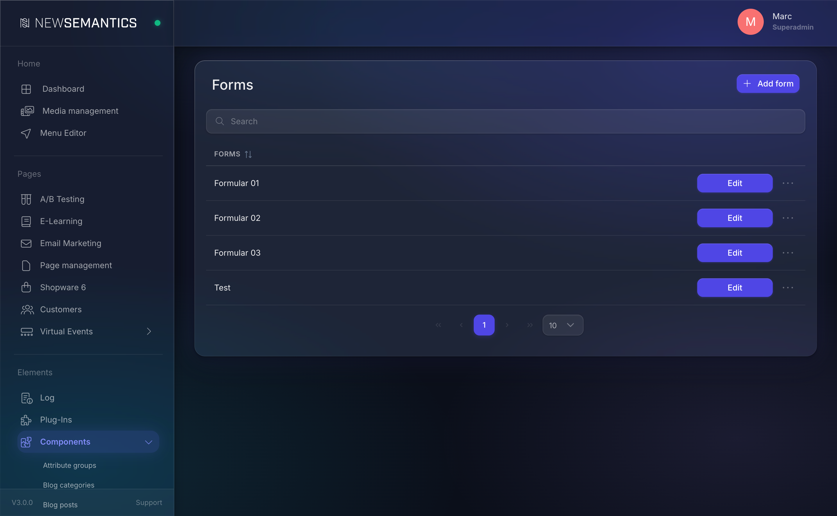
Where to find it
The module lives in the sidebar under Components → Forms. Every form in your CMS appears in the list with its title and the recipient email address.
Form concept
A form has two parts:
- Metadata — the form's Title (shown in the admin list) and a Receiver E-Mail (the address submissions are sent to).
- Fields — the inputs the visitor fills in. Each field has a title, a type, an optional Value type marker, a Mandatory flag, and a width setting.
Forms are independent of pages. You create a form once, then reference it from any Form Widget on any page. The same form can be used on the contact page, in a popup, and in the footer — submissions from all three places land in the same inbox.
Field types
When you add a field, you pick one of the built-in types:
| Type | Rendered as |
|---|---|
| Text Line | Single-line text input. |
| Textarea | Multi-line text input. |
| Upload-Form | File upload field (visitors attach a file to their submission). |
| Checkbox | Boolean checkbox (for consent, opt-in, terms). |
| Phone | Phone number input with formatting. |
| Country | Dropdown of country names. |
| Radio group | A set of radio buttons built from your option list. |
| Date | Date picker. |
Checkbox and Radio group fields use a child list of Values — the options the visitor chooses from. You add those inline when you create the field.
Value type
Each field can be tagged with a Value type to help the form handler build a useful email. The options are:
| Value type | Purpose |
|---|---|
The value is used as the Reply-To address in the submission email. | |
| Subject | The value is used as the email subject line. |
| Name | The value is used as the sender name in the submission email. |
| Custom | The value is appended to the email body as plain content. |
Mark exactly one field per form as E-Mail so your reply-to address is correct; the rest can be Custom.
Width
Every field is either Half width or Full width when rendered on the Frontend. The Pagebuilder's column width decides the pixel reality; Half width fields float side-by-side (e.g. First name + Last name), Full width fields take the full column (e.g. Message).
Mandatory
Toggle Mandatory on every field that must be filled before the form can be submitted. The Frontend marks mandatory fields visually and blocks submission until they are filled.
Submissions
Every submission is emailed to the form's Receiver E-Mail. Uploads are attached. A copy of the submission can be stored in the database for compliance review — ask your administrator whether submission logging is enabled for your install.
Spam and consent
Always add a consent checkbox for data processing on any form that collects personal data. Mark it Mandatory. The CMS does not enforce consent for you — this is a regulatory concern you have to configure.
Form Widget
To show a form on a page, drop the Form Widget into a Pagebuilder column. The Widget has a single required field:
| Field | Purpose |
|---|---|
| Form | Select one of your forms. |
The rendering, validation, and submission handling are the Widget's job; you only need to pick the form.
See also
- Create a form — step-by-step for a contact form.
- Pages & Pagebuilder — where the Form Widget lives.
- Media Manager — for any static downloads you want to pair with a form (e.g. a brochure).