
Rows, Columns, and responsive layout
Control Row structure, Column widths, spacing (padding and margin), and Flex alignment — all per breakpoint so your layout adapts to every screen size.
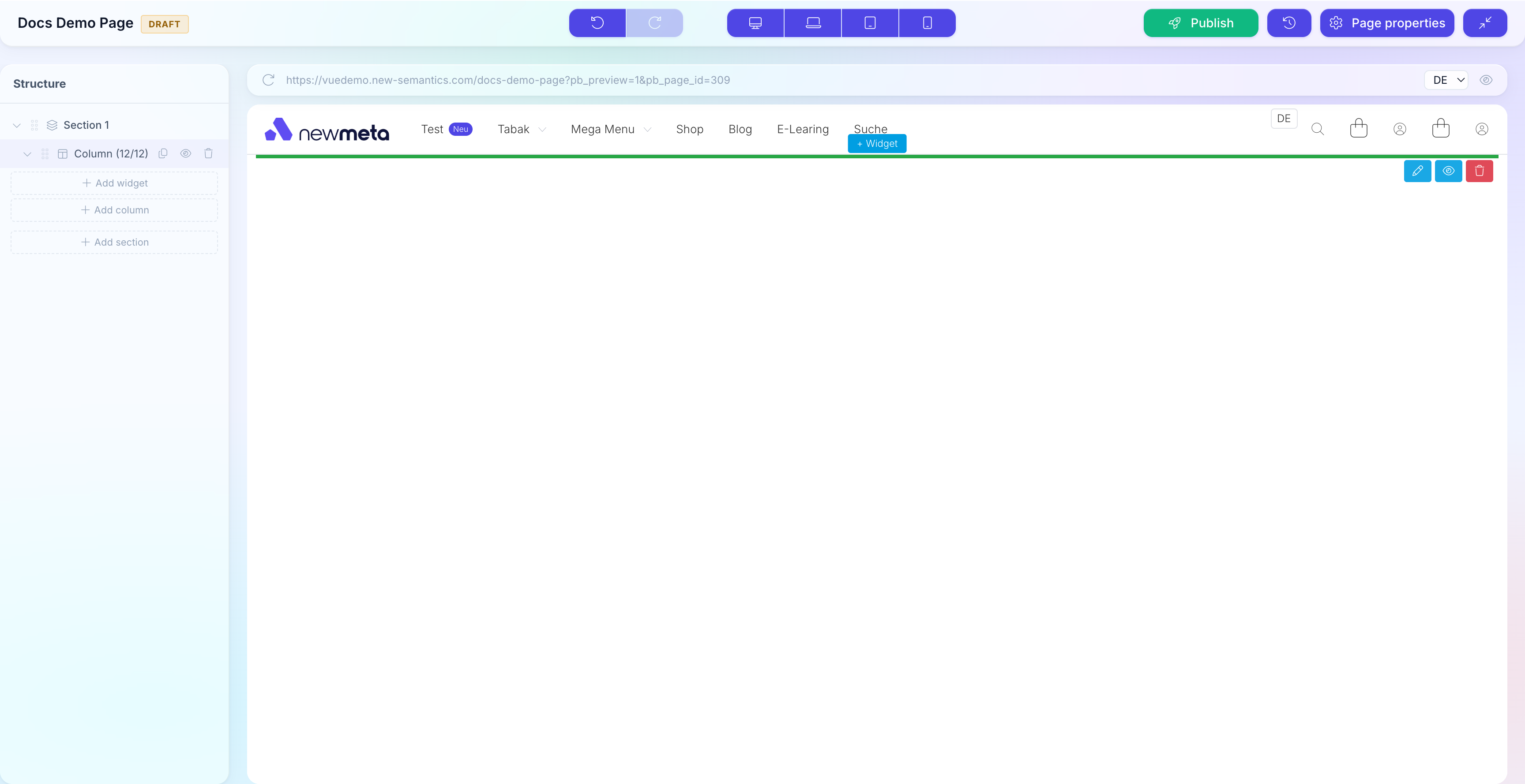
Prerequisite: Your page has at least one Row in the Pagebuilder.
Add or remove Rows
- Add a Row: click the + at the bottom of the page, or use the Add Section button in the Structure Tree root.
- Remove a Row: select the Row in the Structure Tree, right-click, pick Delete. Confirm once.
- Reorder: drag a Row in the Structure Tree to a new position. Rows always stack vertically.
Set Column widths
A Row has 12 units of width. Columns split those units — 6 + 6 is a 50/50 split, 4 + 8 is a one-third / two-thirds split, 3 + 3 + 3 + 3 is four equal columns.
Select a Column in the Structure Tree, then in the Properties Panel set the Width slider or the numeric Grid Units field.
Widths per breakpoint
Each Column has four width settings — Desktop, Laptop, Tablet, Mobile. Set them individually so Columns can stack full-width on Mobile and split 50/50 on Desktop.
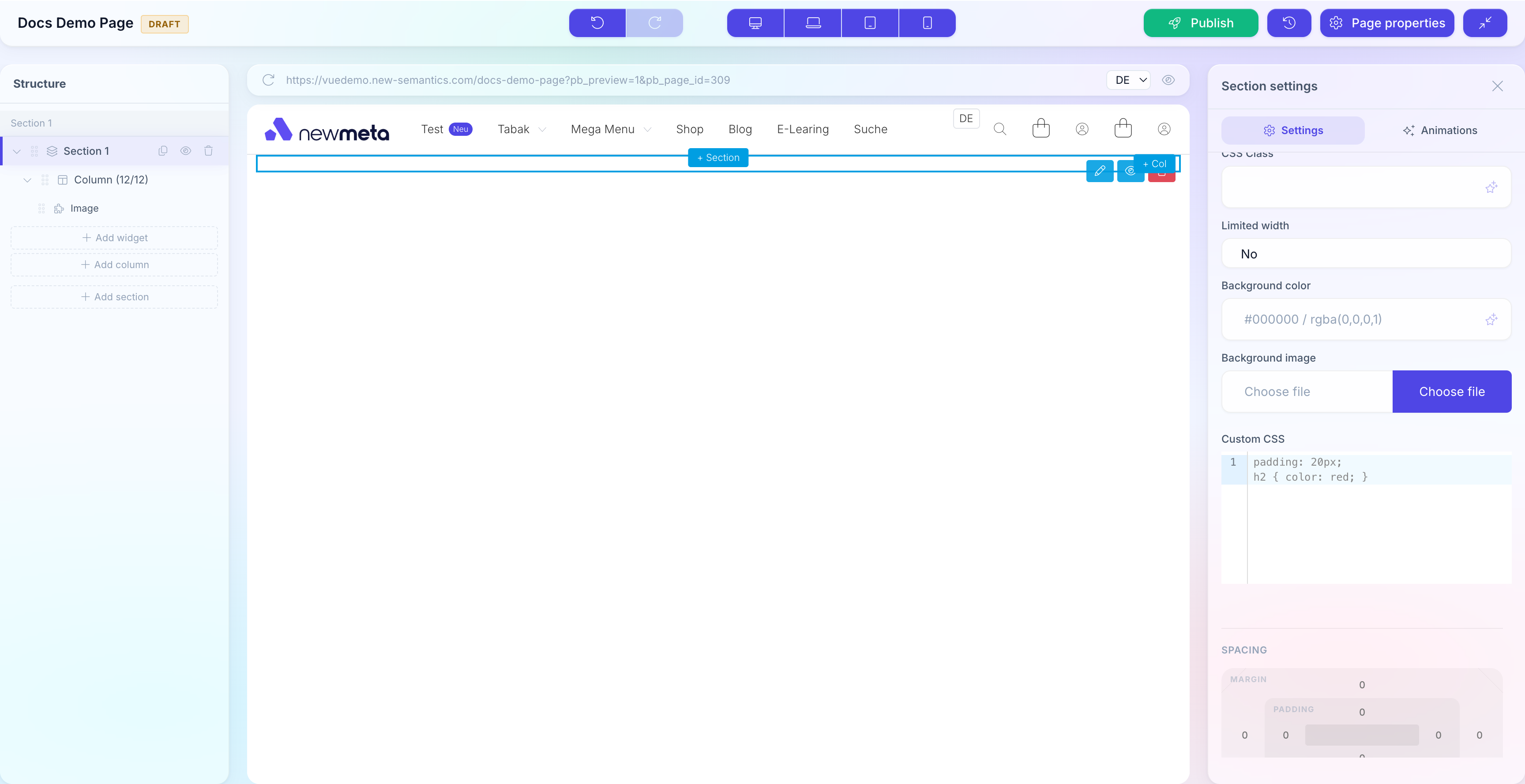
Add spacing (padding and margin)
Rows, Columns, and Widgets each have their own spacing controls. Select the element, open the Settings tab, scroll to Spacing.
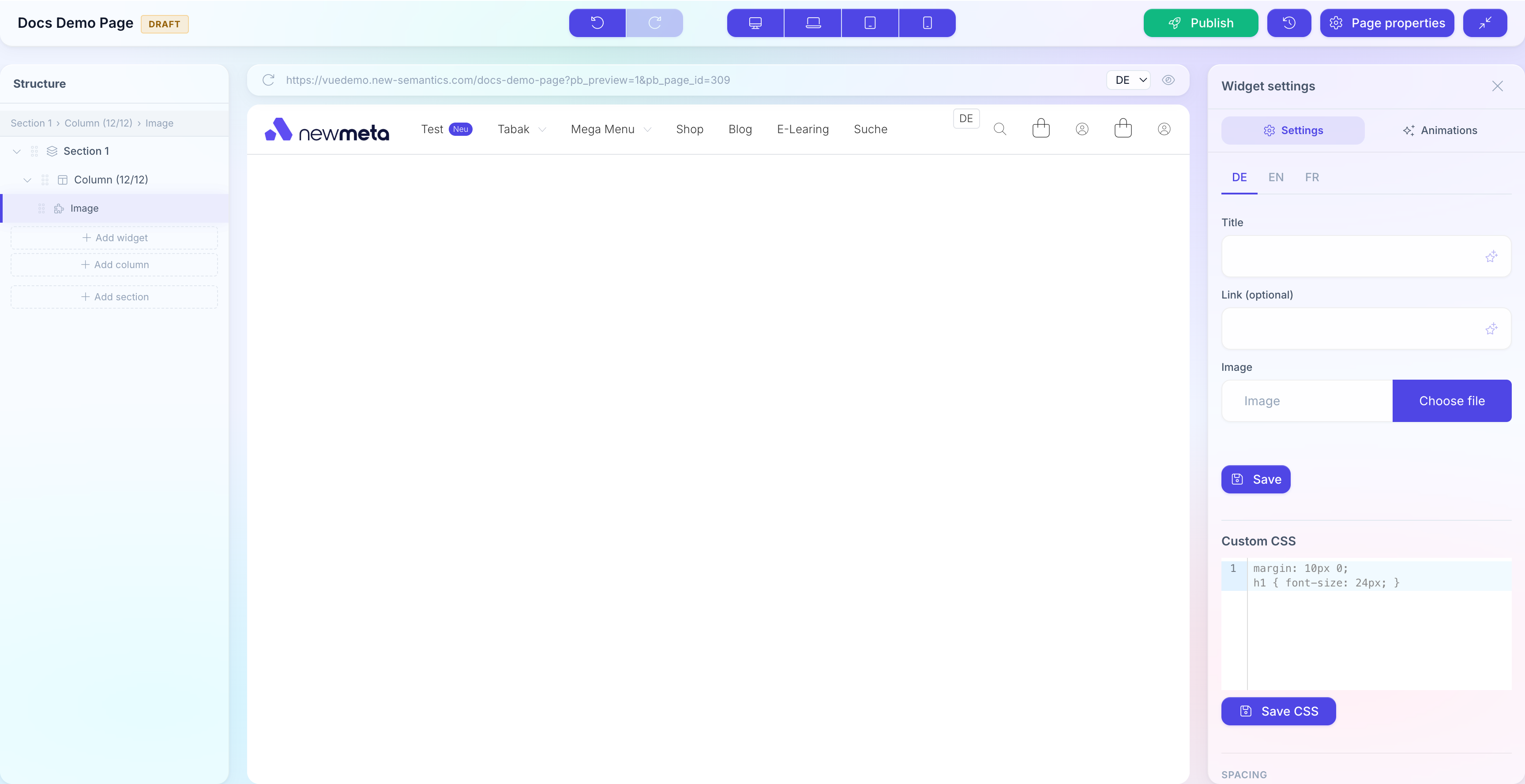
- Padding — space inside the element, between its background and its content.
- Margin — space outside the element, between it and its neighbours.
Click any of the four sides (top, right, bottom, left) to enter a number in pixels. Values set the box-model edges for the currently selected breakpoint.
Same value on all sides
Click the link icon in the center of the spacing box to lock all four sides together — typing one value then updates all four.
Flex alignment (Rows)
Rows are CSS Flex containers. In the Row's Settings tab, the Flex Alignment section controls how Columns align.
| Setting | Effect |
|---|---|
| align-items | Vertical alignment of Columns within the Row (top, center, bottom, stretch). |
| justify-content | Horizontal alignment when Columns don't fill 12 units (start, center, end, space-between, space-around). |
Both settings are per breakpoint.
Breakpoints
The Pagebuilder renders at four breakpoints:
| Breakpoint | Width | Icon |
|---|---|---|
| Desktop | > 1200 px | Desktop screen |
| Laptop | 992 – 1200 px | Laptop |
| Tablet | 768 – 991 px | Tablet |
| Mobile | < 768 px | Phone |
Most settings (Column width, spacing, visibility, flex) have independent values per breakpoint. Switch the top-bar breakpoint to change what you are editing.
Breakpoints inherit downward
A setting you leave empty on Mobile inherits from Tablet, then Laptop, then Desktop. Always set Desktop first, then override downward only where needed.
Hide elements per breakpoint
Rows, Columns, and Widgets have a Visibility checkbox group — one checkbox per breakpoint. Uncheck to hide the element on that screen size.
The element stays in the Structure Tree (with a crossed-out eye icon) but is not rendered on the live site at that breakpoint.
Nest Columns with a Column Widget
Need a sub-layout inside a Column? Insert a Columns Widget — it nests a new Row with its own Columns inside the parent Column. This is useful for Card grids inside a sidebar, or two-up galleries inside a narrow content column.
See also
- Place and configure Widgets — content inside Columns.
- Drafts, Publishing, Versions — publish your changes.
- Pages & Pagebuilder overview
- Design Tokens — global colors, fonts, spacing scales.